Mobile Web Design Denver
“75% of consumers prefer a mobile friendly website”
The Mobile Landscape
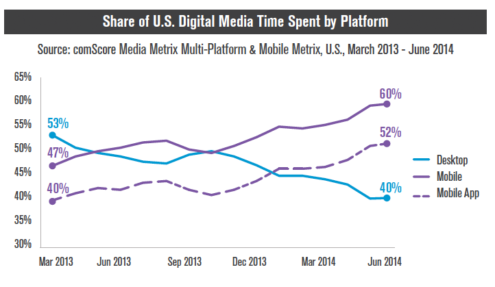
There’s no turning back now. The web has gone mobile. More users are accessing the web increasingly from mobile devices. comScore Media Metrix reports that Share of U.S. Digital Media Time Spent by Mobile is now 60%, with 40% for desktop. Your business definitely a mobile web design today more than ever.
What does this mean for your business?
It means that you must address a mobile web design strategy in your marketing programs – sooner rather than later. Minds Over Media will provide you with an effective mobile web presence and mobile SEO.
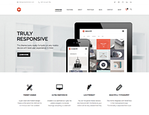
Mobile Site or Responsive Web Design?
There are two directions to take regarding adding mobile design to your web presence. You can go with a dedicated mobile site or responsive web design. The advantages and disadvantages of each are shown on the chart below.

Traditional websites can be difficult to navigate for smartphone users. A mobile site communicates your main website and brand – just scaled down and formatted for mobile devices.
Attract more traffic from the mobile web design with a sister mobile website designed by Minds Over Media. When a mobile user visits your main website, this will be auto detected and the visitor will be seamlessly sent to the mobile version of your website. Having a site customized and formatted for mobile users will increase your audience and the time they spend on your mobile site to learn more about your business.
Benefits of having a mobile website
- Users are more likely to come back when they like the site, and in turn will use it more efficiently and effectively
- Increase in brand and reputation
- Increase in sales
- Increase in leads
- Enhanced customer loyalty
Minds Over Media will provide you with an effective mobile web design and mobile SEO. When someone is using a mobile device to access your website, they will be automatically redirected to a mobile version of your site that is designed and optimized for mobile.
TEN KEY CONSIDERATIONS FOR MOBILE STRATEGY
1. Define Needs of Mobile Web Design
Are your customers using mobile devices to search for services such as yours? Do you want to make sure that you are found on mobile devices? Most likely they are, and this will only continue to increase in the future.
2. Consider Business Objectives
Objectives will be prioritized, and that hierarchy will be communicated in the design. Mobile devices are smaller than laptops or desktops, so the focus of a mobile design will be on the top priorities of the business.
3. Study Past Data
Your main website has been tracking traffic with Google Analytics. This enables us to analyze things like which devices (iPhone, Android, iPad, etc) have been used to access your site, which carriers (AT&T, Sprint, Verizon, TMobile), how many visits by each etc.
4. Responsive Web Design
With so many new mobile devices being released every year, the website will have to be optimized for a wide range of mobile web browsers. The site will have to be scaleable and adaptable to any device.
5. Simplicity is Golden
When converting a desktop site design to a mobile web design format, you want to simplify things wherever possible. There are several reasons for this. Keeping file size and load times down is always a good idea for mobile sites. Wireless connections – while faster than years past – are still relatively slow, so the faster your mobile site loads, the better.
However, we can still create aesthetically pleasing designs that are optimized for mobile.
6. Single-Column Layouts Usually Work Best
A single column structure tends to work best. Not only does this help with managing limited space on the smaller screen, it also helps you easily scale between different device resolutions and flipping between portrait and landscape mode.
7. Vertical Hierarchy: Think in Collapsible Terms
A good way to organize things in a simple and digestible way is to set up a collapsible navigation. Take a single column structure a step further, you can stack chunks of content in folding modules that allow the user to tap open the content that they’re interested in and hide the rest.
Contact Us:
Minds Over Media LLC
303-521-6681 (tel)
866-667-8646 (fax)
Email Us

Follow Us!